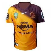
Broncos Auckland 9's Jersey.

A lot of people were saying a few months ago that the Warriors have the best jersey designs in the NRL

They sure do! Compare our jersey with this

35314_20_1.jpg


Hopefully our position on the NRL ladder is completely opposite to our position on the awesome jersey ladder.
 
**** me, these guys are masters at thinking outside the box.

Unbelievable stuff.

The colors.... What a complete **** up.
 
They sure do! Compare our jersey with this

35314_20_1.jpg


Hopefully our position on the NRL ladder is completely opposite to our position on the awesome jersey ladder.

Yeah the Cronulla Bulldogs would love it. I don't want a bunch of twelve year old creating new jerseys every week. Especially at $170. The Warriors will be the first team to have glow in the dark jerseys.
 
At first look I couldn't even notice the black, but then I saw the contrast with the maroon panel and it looks horrendous. How the hell do the designers come up with such junk? Honestly everyone on BHQ would come up with better designs and we're not even professionals. It dead set looks crap. Even having it plain black without the maroon panel would of looked better. Last years jersey was a hell of a lot better.
 
Last edited:
Yeah it's garbage. Can someone please hire a talented fucking graphic designer at the club so our jersey's don't suck every fucking year
 
Hopefully the yellow number on the back makes it gel a bit better, I thought they would of made something better but oh well.

End of the day if we win the 9s I couldn't care less about the jersey
 
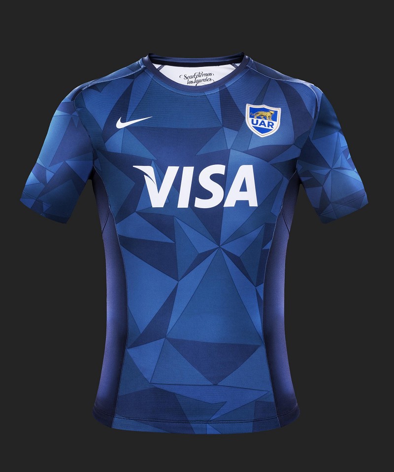
While it's all hypothetical now, would have loved to have seen another Nike catalogue jersey Broncos-ised to yellow and maroon

argentina15altfront.jpg
 
Lol seriously this would have taken 2 minutes to do, hope we did not actually pay someone to design it...
 
Meh. I like it. The brandimg on the back doesn't look good though.

I prefer this than our reg season jersey, the gold trimming looks heaps better than the white.

I definitely like it more than that warriors luminous blue jersy that was posted. That looks like it was designed for kids. Our design might be simple but at least it has some class.

What do you guys want as far as complexity goes? Flaming skulls with snakes in the eyes? The extremely tacky diamond print from the super league?
 
It'd be nice to come up with a BHQ design and put that forward to the Broncos when the next jersey is up for redesign.
 
It'd be nice to come up with a BHQ design and put that forward to the Broncos when the next jersey is up for redesign.

Hell yeah!!! It'd be better than anything the Broncos designers have produced in recent years.
 
Don't mind it at all. I think it would make a pretty good away jersey.

It does look a bit "Stormy" though, especially with the purple sponsor logo.
 
Hell yeah!!! It'd be better than anything the Broncos designers have produced in recent years.

Agree - I doubt the Broncos would have an inhouse jersey design team - surely Nike would offer it as part of the merchadise deal, so they're the ones to blame. So too the Broncos management ultimately responsible (head of marketing?) for pulling the trigger on the design.

Nike's the premier football brand in Europe, why that doesn't translate in Australia for the Broncos, I'm not sure.
 
Has anyone seen this year's away jersey? Looks pretty good in my opinion. I saw it at Rebel, but couldn't find any pictures online. The box is gone, with the NRMA logo in black writing. It still has the faded in colour look, but the transition looks a lot... cleaner? It looks a lot more like a straight swap of last year's home jersey. Much better than our new home jersey too.
 
Has anyone seen this year's away jersey? Looks pretty good in my opinion. I saw it at Rebel, but couldn't find any pictures online. The box is gone, with the NRMA logo in black writing. It still has the faded in colour look, but the transition looks a lot... cleaner? It looks a lot more like a straight swap of last year's home jersey. Much better than our new home jersey too.

For anyone that was wondering what it looked like. Seems strange after seeing that white box so much.
 

Attachments

  • 2015.JPG
    2015.JPG
    19.7 KB · Views: 93

Active Now

  • Maddy
  • Jazza
  • Harry Sack
  • Dexter
  • RolledOates
  • ChewThePhatt
  • Locky24
  • Socnorb
  • azza.79
  • Fitzy
  • Reds2011
  • Dash
  • Broncosgirl
  • GCBRONCO
  • BRC088
  • Lostboy
  • Sproj
... and 1 more.
Top
  AdBlock Message
Please consider adding BHQ to your Adblock Whitelist. We do our best to make sure it doesn't affect your experience on the website, and the funds help us pay server and software costs.