Broncos Auckland 9's Jersey.

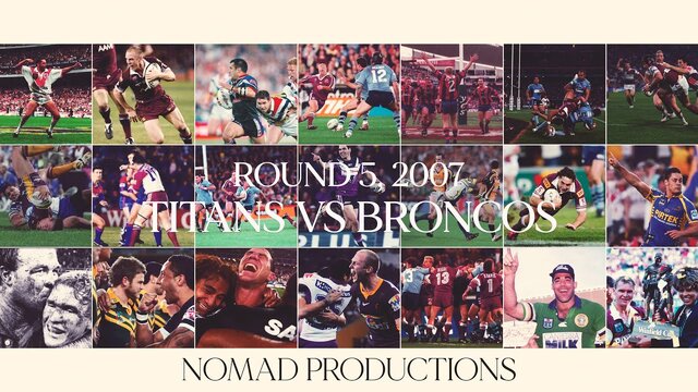
For anyone that was wondering what it looked like. Seems strange after seeing that white box so much.

Why the **** did anyone think the white box was a good idea? I'd actually like that jersey if the maroon went all the way across to underneath the arm.
 
Why the **** did anyone think the white box was a good idea? I'd actually like that jersey if the maroon went all the way across to underneath the arm.

I remember at the time their twitter poster said the box was due to the designers being able to put the NRMA logo of the gradient effect, as it couldn't be read. The obvious solution was to lower the logo (which they now have, along with slightly raising the gradient effect). Dunno how they couldn't figure that out earlier.
 
Is the NRMA logo black? Wouldn't it look better if it was maroon???
 
Is the NRMA logo black? Wouldn't it look better if it was maroon???

It does look kind of maroon. That one simple change has already made me not hate this jersey.
 
Is the NRMA logo black? Wouldn't it look better if it was maroon???
It's not all about looks, it has to stand out or NRMA might feel they're not getting their money's worth. Still a huge improvement, I hate when they put the logos in a box, it kills the look, this I'd a huge improvement.
 
It's not all about looks, it has to stand out or NRMA might feel they're not getting their money's worth. Still a huge improvement, I hate when they put the logos in a box, it kills the look, this I'd a huge improvement.

Maroon still stands out in a yellow background though. It still has to be visually appealing.
 

Active Now

  • Battler
  • KateBroncos1812
  • Harry Sack
  • Skathen
  • Fitzy
  • Kev_Guz
  • Dash
  • broncos4life
  • Johnny92
Top
  AdBlock Message
Please consider adding BHQ to your Adblock Whitelist. We do our best to make sure it doesn't affect your experience on the website, and the funds help us pay server and software costs.