Broncos Old School logo

Status
Not open for further replies.
DIEHARD

DIEHARD

NYC Player
Mar 4, 2008
139
9
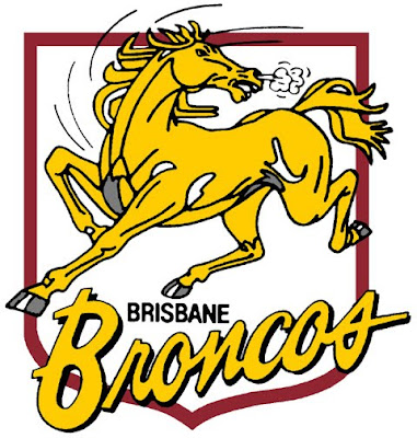
I love the old Broncos logo from 1988-1999. And with Parramatta returning to an old school 80-90s version. I wonder how Broncos fans would think of a possible return to an old school or maybe revamped bucking gold Bronco logo?

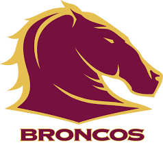
Or would you prefer the current logo? [icon_confu
 
The Rock said:
Ha, the old Bronco logo absolutely kicks arse over our current one. The Broncos would never go back to the old logo, we love ourselves too much and it would seem like a "backward step" if we did. Stupid attitude, but it's the sort of attitude that the club seems to have with these things.

This. 100%
 
icon_thumbs_u icon_thumbs_u icon_thumbs_u icon_thumbs_u icon_thumbs_u icon_thumbs_u icon_thumbs_u

brisbane_1988.jpg
 
God I love that logo. :D
 
I like the new one and am glad we have a club that moves on with the times.
 
Our current one is more marketable.
 
Big Pete said:
Our current one is more marketable.

That's the gist of it.

Sport these days is ruled by money. It's unfortunate, but true.
 
Won't know until it happens really.

And correct me if I'm wrong but the differences between that logo and ours is fairly minimal in comparison?
 
Yeah, you're dead wrong.

images


The old one looks like a Bronco.

The new one looks like a Chess piece.
 
No.

I mean, will the Parramatta logo be undergoing as many changes as the Broncos logo would be? Like I'm pretty sure their old logo and new logo are fairly similar, just the Eels is positioned differently.
 
The Rock said:
Heaps of clubs are exploring their traditional values and the old stuff is becoming just as (or even more) marketable.

Which is why we won't go back to our old logo - we like to be seen as the leaders, not followers
 
Rocky, you're being a big drama queen mate. I, too, prefer the old logo, but I reckon keeping a new logo is hardly an indication of a club that loves itself too much :roll:
 
What does the original one look like Rocky? I know what the current (or at least it was current) one looks like.

Either way, I'd imagine it'd be as BIG a difference as the Broncos.

I prefer the old one as well, but I'm a die-hard fan, in terms of marketing, I see more value in our current one than our old one - unless we're trying to sell some vintage merch.
 
The Rock said:
Jeba said:
Rocky, you're being a big drama queen mate. I, too, prefer the old logo, but I reckon keeping a new logo is hardly an indication of a club that loves itself too much :roll:

If the topic came up we'd probably never do it because we think we're too good for it even though most of the Broncos community would prefer it.

But the Broncos don't need to appeal to the 'Broncos community'. They're already fans. They need to appeal to the outsider.
 
They need to advertise to both.

The current one does a better job of it.
 
The Rock said:
Um yes they do. Appealing to the Broncos community is pretty important considering the Broncos community are the ones buying all the merchandise.

And just to add to that, our old Broncos logo is actually quite marketable.

Hmmm, the Broncos community are going to purchase merchandise regardless of the logo. Only a minority would neglect buying anything just because the logo isn't the old school one.

I hate calling it a logo BTW. Is the club a franchise? Fkn Americanisation.

I long for the days when a logo was called a badge or a crest. icon_smile
 
The Rock said:
Not entirely true. If people don't buy the Broncos jersey because of the WOW sponsor, then I'm pretty sure a logo design could also influence one's decision to buy a jersey or a piece of merchandise. [icon_wink

Haha, touche.
 
I think you need to also look at it not just in terms of numbers but the intensity of the support of Broncos fans. Sure there are hundreds of thousands, maybe millions. But there can be different levels of their involvement and enthusiasm.

Appealing to the Broncos community isn't a bad thing at all, because that community is very big and powerful.

I don't want to be seen as trolling because Im a Gold Coast Titans fan, but my two cents is that the original logo does encompass the true spirit of what a Bronco is and the new one looks too much like the Denver Broncos logo, including the font.
 
Status
Not open for further replies.

Active Now

  • Bish
  • Galah
  • 1910
  • Culhwch
  • Old Mate
  • Mister Wright
  • Jedhead
  • Behind enemy lines
  • Midean
  • KateBroncos1812
Top
  AdBlock Message
Please consider adding BHQ to your Adblock Whitelist. We do our best to make sure it doesn't affect your experience on the website, and the funds help us pay server and software costs.