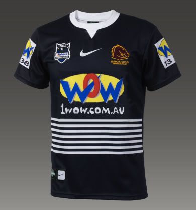
New Broncos jersey for Dragons match

Exactly. Money.

Wow was willing to pay the money.
 
Nova isn't any better, I want that white shit gone.

How come other teams don't need to have that white box crap on their jerseys :(
We're one of 5 teams I think who have that white box type sponsor on the jersey but the others don't seem anywhere near as bad.

I know it's all about "money" but surely the look of the logo needs to be given some consideration, it does potentially lessen jersey sales(to what extent is anyone's guess) amongst other things.

It's me ranting again about the WOW logo but seriously it looks like a 12 year old photo shop job the way they've done it. I guess it's doing its job though because that WOW logo, for the right or wrong reasons, certainly sticks to your memory.

This (credit to Gut) looks amazingly awesome and 1000x better just by removing that white crap. Could also remove the white on the sleeve to make it even better. I should stop dreaming though because it won't happen.
broncosblue.jpg


/rant.
 
broncospwn said:
This (credit to Gut)

HA! This just proves you never read other posts on the board!

Absolutely agree with you though.

Despite that colourful stain on the front I actually caved and went to buy one, but nikestore.com.au doesn't ship overseas. Poo poo.
 
I'm salivating at that jersey pain job!

I really want to buy one but can't justify the cost.
 
im still not sure why people like it so much? its just a 100% blue jersey with some white stripes thrown on it. its boring, and its not the broncos colours. i must be missing something if thats considered even a decent jersey.
 
Anonymous person said:
i must be missing something if thats considered even a decent jersey.

The meaning behind it maybe.
 
Connell was affiliated with Brothers from memory, hence the blue, or maybe it was Valleys, blue again. That is the only link I can see. Personally I don't like it as not Broncos at all, not even close.
 
Aeetee said:
Anonymous person said:
i must be missing something if thats considered even a decent jersey.

The meaning behind it maybe.
thats got nothing to do with people saying that its an awesome jersey and that it looks great though.

sure, the meaning behind it is good, but that doesnt change the fact that its just an all blue jersey with some white stripes, worn by a team whos colours are maroon, yellow and white.
 
I quite like the look of the jersey itself, but agree with AP - I hate it as a Broncos jersey. I appreciate the club wanting to honour Cyril Connell, but surely there is a better more meaningful way to do that than by commissioning a special jersey that looks nothing like it represents the club. If it did not have the Broncos logo on it, you would never see it and associate it with the Broncos.
 
The navy blue has become a lot more prominent in Broncos colours since the 2001 away jersey. Personally I reckon it looks so awesome because of its simplicity and the meaning behind it makes it even better.
 
I don't get this whole "navy blue is not our colour" argument. As Jeb says, it's been one of our colours for at least the past 9 years!! Just because most of you haven't accepted it doesn't mean it's not one of our colours. I think the jersey looks fine although on top of wearing the away outfit against the warriors earlier in the year, we don't seem to have worn the maroon gear as much this year.
 
Crazy Sam said:
I don't get this whole "navy blue is not our colour" argument. As Jeb says, it's been one of our colours for at least the past 9 years!! Just because most of you haven't accepted it doesn't mean it's not one of our colours. I think the jersey looks fine although on top of wearing the away outfit against the warriors earlier in the year, we don't seem to have worn the maroon gear as much this year.
its been one small part of our AWAY jersey. the colours on your HOME jersey are the teams colours. theres no blue there.
 
Blue was added to the jersey in 2001 as a minor colour to show the aforementioned historical link with the colours of Brisbane. However, this was later dropped from the design in favour of a mainly maroon jersey with gold trim.

My guess is they are bringing it back for this game. Don't see what the big deal is. One game, awesome meaning.

IMO I would love it as an away jersey.
 
Yup, I would love to see this jersey as our away jersey and our yellow heritage jersey as our home jersey.
 
Jeb you have officially now lost the plot, the yellow jersey as the home jersey and not the maroon that we have had from day one tisk tisk
 
Russo said:
Jeb you have officially now lost the plot, the yellow jersey as the home jersey and not the maroon that we have had from day one tisk tisk
Might want to check back to the early days, the jersey was primarily yellow to begin with.

The heritage jersey should be our home one IMO too.
 
Russo said:
Jeb you have officially now lost the plot, the yellow jersey as the home jersey and not the maroon that we have had from day one tisk tisk

Original jersey:
5945.jpg


Heritage jersey:
nrl_broncos08heritagejersey.jpg


There's plenty of maroon there anyway you goose!!!! You must be in trouble if AP is agreeing with me against you [icon_lol1.
 

Active Now

  • leith1
  • Harry Sack
  • 1910
  • BRC088
  • Ghost of Vlansys
  • kiwibronco
  • Galah
  • Allo
  • Morkel
  • Financeguy
  • Xzei
  • bb_gun
  • davidp
... and 2 more.
Top
  AdBlock Message
Please consider adding BHQ to your Adblock Whitelist. We do our best to make sure it doesn't affect your experience on the website, and the funds help us pay server and software costs.