nopatience101
NRL Captain
- Mar 4, 2008
- 3,472
- 6,339
Regardless of how misguided its design was, at least you couldn't say they didn't put any effort into it, these days it always looks like an afterthought which is silly considering its the most prominent and valuable image the club has at its disposal. It should be treated with more respect, it can still fulfill its commercial objectives without being turned into a soulless billboard.Is anyone else getting sick of the 'this wouldn't have happened under Wayne!' line that gets trotted out everytime the club does something less than ideal.
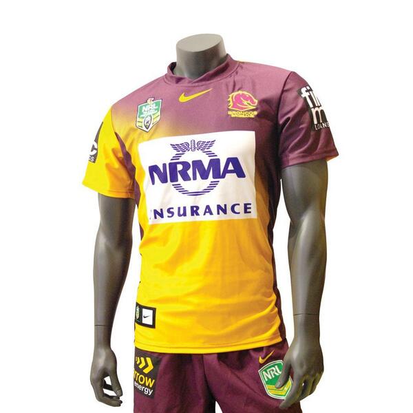
Yes, sometimes the statement is applicable. However, if you thought this jersey was bad...

think again.
Even Gordie looks ashamed to be seen in it.

Last edited: