Brisbane Broncos Jersey Reveal

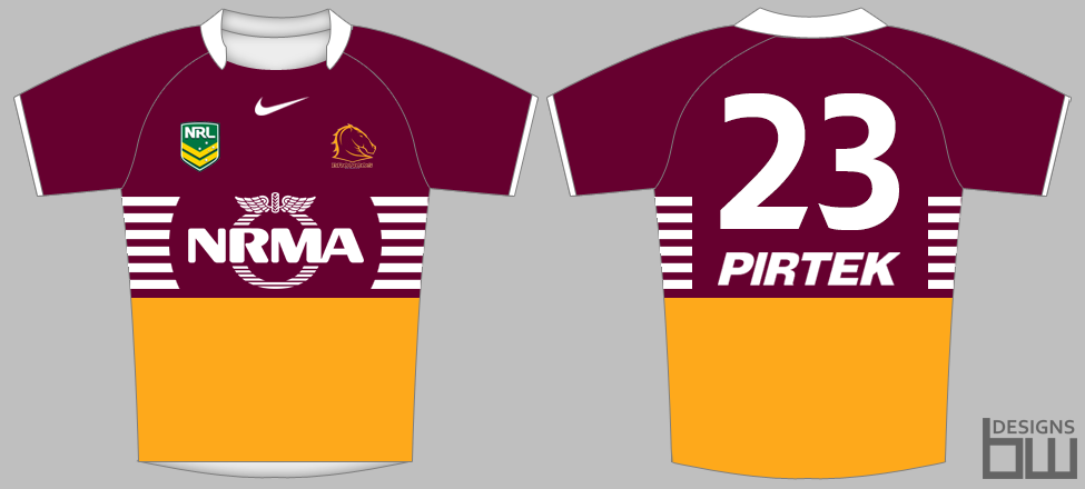
jesus christ, they must have hired the same guy who designed the last one. chuck a couple of yellow lines on the bottom of an all maroon jersey and call it a day. the hashtag thing is just embarrassing.

I agree mate, Nike is really letting the Broncs down at the moment in the design aspect and technology of these jerseys. This is another half arsed job that leaves us looking behind the times.

Even the jersey composition is poor. The fabrics look cheap. Compare a Nike on field players Jersey to say, a CCC Qld State of Origin Jersey and they are poles apart in quality.

Surely it's not that hard to go back to our original strip, using a modern cut and modern fabric. THAT is the Broncs identity, circa 92' 93'. We seem to have lost our way with our playing kit over the past decade, coinciding with Nike becoming the supplier.
 
meh, I'll buy it.

It looks alright, I don't see what all the angst is about unless you are a graphic designer or a 15 year old girl you shouldn't be so caught up in jersey 'fashion'. It's a broncos jersey, buy it and wear it

Free license to vent angst then. I could do better with crayons.
 
The jersey is fucking horrible.
 
I thought there was meant to be a special, fucking, announcement?

Surely Milford wasnt the announcement.........................or the jersey for that matter.

Maybe the said 'Big' announcement, which could be a reference to the large jersey....that would be a bad joke if it was the case.
 
Have we still not "officially" signed Boyd ?! Surely the conference wasn't just for the jersey...
 
Maybe the said 'Big' announcement, which could be a reference to the large jersey....that would be a bad joke if it was the case.

Man, so disappointed. I guess it was my fault to expect something else.
I was thinking confirmation of Boyd signing, New FRF signing, Reed retiring............something!
 
*shrug*

I don't mind it.

Won't be buying one because jerseys are about as comfortable as wearing garbage bags but it isn't an eye-sore.

Like the way they announced it too - pretty bad-ass. Cool to see Milford in team colours.

Fans expecting a signing just got too caught up into the hype.

One thing at a time.
 
I don't mind it.

Won't be buying one because jerseys are about as comfortable as wearing garbage bags but it isn't an eye-sore.

yeah i dont mind it either. but also won't buy largely for the same reason you've posted.

will grab a new polo if this years are nice
 
I care about results and couldn't give a shit about jerseys but this is a message board and a jersey thread so here's my opinion.

I think it's a horrible kit. The white sleeves and collar are super tacky. The stripes start way too low and ruins the whole composition of the front.

Galatasaray has very similar team colours to ours and they put out much classier looking kits.

Was there any player announcements today? If not they over hyped this way too much.
 
*shrug*

I don't mind it.

Won't be buying one because jerseys are about as comfortable as wearing garbage bags but it isn't an eye-sore.

Like the way they announced it too - pretty bad-ass. Cool to see Milford in team colours.

Fans expecting a signing just got too caught up into the hype.

One thing at a time.

It adds to the disappointment to me. An unveiling like that is warranted for something broundbreaking. Now I just feel like the South Park characters when they see God. "Well what did you expect him to look like"? "Well, not like that".
 
Portfolio - 2014 NRL Jumper Ideas | BigFooty AFL Forum

Same idea, better execution IMO

Bris2_zpsd7d7a383.png
 
*shrug*

I don't mind it.

Won't be buying one because jerseys are about as comfortable as wearing garbage bags but it isn't an eye-sore.

Like the way they announced it too - pretty bad-ass. Cool to see Milford in team colours.

Fans expecting a signing just got too caught up into the hype.

One thing at a time.

I like it too..

Better than the off the shoulder yellow shit and back to more traditional design.

The whole kit together (especially on Milf!!) looks much better than just the jersey from the Broncos Shop on a manequin
 
The white sleeves and collar are super tacky.

i actually like that

its just the strips at the bottom arent right and they dont go all the way round.

the mock up posted just above would have been great.
 
A signing of a fullback excess to our needs, that is as inevitable as the sun coming up tomorrow...

Yeah, really disappointed about that.
 
I quite like it much improved on this years one. I don't see how it's behind the times or whatever some of the other comments are saying
 

Active Now

  • Yellowfella
  • winslow_wong
  • FACTHUNT
  • IceWorks
  • Justwin
  • Cavalo
  • bb_gun
  • Harry Sack
  • Lurker
  • Xzei
  • Battler
  • Allo
  • Browny
  • mrtij
  • Scdeac
  • Foordy
  • Waynesaurus
  • Kev_Guz
  • Santa
  • Skyblues87
... and 8 more.
Top
  AdBlock Message
Please consider adding BHQ to your Adblock Whitelist. We do our best to make sure it doesn't affect your experience on the website, and the funds help us pay server and software costs.